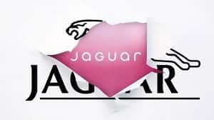
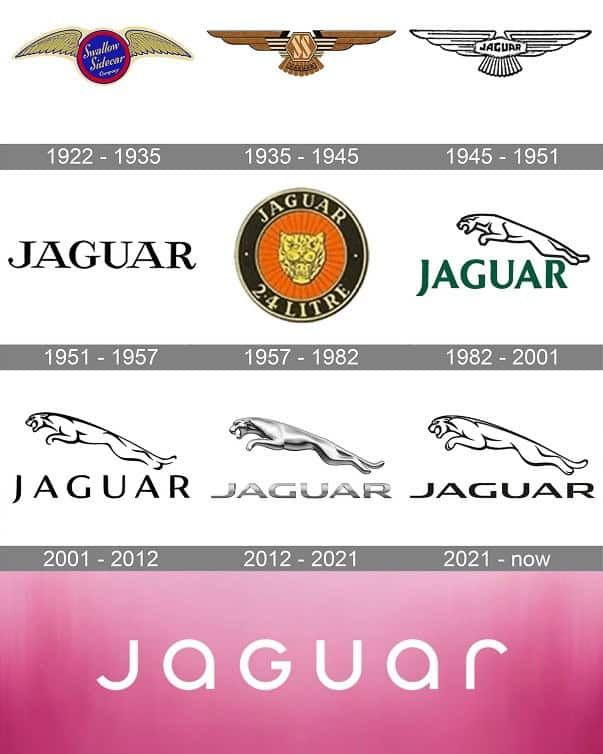
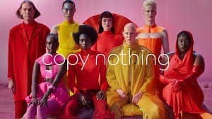
Taking the internet by a whirlwind of criticism, discussion, and admiration, the 103-year-old automotive company Jaguar recently took to their social media platforms to reveal their newly designed logo in the form of a 30-second video titled ‘Copy Nothing.’ Unveiling the company’s name in a vibrant, colorful, and cheery way, the video aimed to bring about large-scale transformation in the brand’s identity. The newly rebranded logo features a minimalistic style in the fashion–‘jaGUar’–a mix of uppercase and lowercase rounded sans serif alphabets. Geometric in nature, the new design follows symmetry. The company’s logo was long associated with the leaping jaguar, first introduced in the 1950s. Its new dynamics replace the wild cat in the wordmark from which the company draws its name with a blend of a small and big case ‘Jr’ in a circle that’ll appear on the cars. The leaping cat would now be seen on the door of the car.
Jaguar’s ‘revolutionary’ instincts surfaced when they announced a car-making hiatus last year-something which was unheard of in the automobile industry. ‘XEs, ‘XFs, and F-Types constituted the last few to be released at the beginning of 2024. E-Pace and F-Pace SUVs will be the last few models standing till they go off showrooms in the first quarter of 2025. The company aims to build fully functional electric cars while eliminating all petrol and diesel-run SUVs and sports cars. This new lot of e-cars is said to go on sale in 2026. While their break was initially perceived to be for reinventing their models, the rebranding surely came as a surprise.
A part of the logo reveal’s theme draws its inspiration from the founder, Sir William Lyon’s view that ‘Jaguar should be a copy of nothing.’ In line with this, the brand has certainly transformed in a way no other brand in the industry has. From fearlessly leaping for a complete showdown on manufacturing cars or rebuilding a chic logo, the luxurious brand brought a steady force of challenges to tackle. But fearless and challenging defines Jaguar according to its managing director, Rawdon Glover. ‘This is a complete reset.’ he says, ‘Jaguar is transformed to reclaim its originality and inspire a new generation. I am excited for the world to see Jaguar finally.’
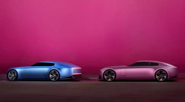
In a bid to trace its way back in the eyes of global audience and also garner a new and young set of audience, Jaguar put its master plan to practice in 2022 by making all of their social media handles spick and span first, forcing curiosity in the minds of the masses. What followed was the reveal of the newly designed logo directly on November 19th, 2024 (Yes, the elephant in the room). This got them exactly what they wanted. Attention, check. Effortless publicity, check. A booming internet presence, also check. Taking full advantage of this checklist, Jaguar unveiled what had been going on behind the closed doors of its garage for the first time in 2 years. They presented two new and unarguably distinct concept car models from the traditional Jaguars, termed ‘Type 00’–(First zero for Restart and the other for zero emissions). The color of the cars is in sync with their new flamboyant personality, one Miami pink and the other London blue. While the former color is an ode to the location where it was revealed, The Miami Art Show; the latter honors the company’s British roots.
In a bid to trace its way back in the eyes of global audience and also garner a new and young set of audience, Jaguar put its master plan to practice in 2022 by making all of their social media handles spick and span first, forcing curiosity in the minds of the masses. What followed was the reveal of the newly designed logo directly on November 19th, 2024 (Yes, the elephant in the room). This got them exactly what they wanted. Attention, check. Effortless publicity, check. A booming internet presence, also check. Taking full advantage of this checklist, Jaguar unveiled what had been going on behind the closed doors of its garage for the first time in 2 years. They presented two new and unarguably distinct concept car models from the traditional Jaguars, termed ‘Type 00’–(First zero for Restart and the other for zero emissions). The color of the cars is in sync with their new flamboyant personality, one Miami pink and the other London blue. While the former color is an ode to the location where it was revealed, The Miami Art Show; the latter honors the company’s British roots.
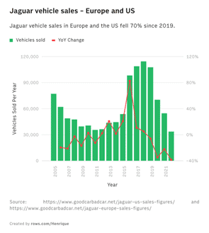
Was it an absolute disaster or an entirely genius move? Perhaps something in between because several marketing gurus criticized it but it was also lauded by the media giant Forbes. The Internet first erupted like a volcano as the infamous 30-second clip went online. It does not feature a single car-which was startling–coming from a company that sells cars. The traditional audience of the luxurious brand found it hard to accept this new ‘exuberant’ avatar that Jaguar seemed to transform into. As the brand moves to the climate-conscious EVs, the Gen-Z and late Millennial preferred type, it had to grab their eyeballs to their cause whether by hook or by crook.
Owing to this, the video features a diverse set of models. But again, threats of the traditional customer base drifting away stay relevant as ever due to the modernized look of their first EV. It stands entirely different from the earlier and much-loved models. It’s hard to find a single comment of appreciation on every social media platform that the video is on, yet, the social media team at Jaguar seems to be working super hard to answer every piece of criticism thrown their way with patience, thus building a strong internet presence. CEO of Tesla Motors, Elon Musk was amongst the critics to comment on their Post on X, “Do you sell cars?” At the same time, marketing genius Rory Sutherland holds a strong opinion that Jaguar cannot survive on a group of people who love the brand but don’t buy the cars. The smartphone giant ‘Nothing’ was also not behind in joining the bandwagon and temporarily changing their typeface to that of Jaguar’s and posting ‘Copy Jaguar’ adding a comic relief to the saga. Internet’s favorite phrase, “Go Woke, Go Broke.” was also quick to surface once the video was up as criticism for its diversity representation. Which Director Glover at Jaguar calls “vile hatred and intolerance.”
But if only the keyboard warriors ruled the game. While the comments had been deeply upsetting and negative, the video of barely half a minute had over 3.3 million views on YouTube and 8.2 million views on Instagram as of December 15, 2024. So much for a brand’s video that doesn’t even feature what they are selling. Nothing quite sums up the new face of branding and advertising in today’s age better than this. Forget Lewis Hamilton moving to Ferrari or BMW’s new model–Jaguar’s truly unique and effective marketing strategy has sparked curiosity and interest in the minds of people at a time when they are not even in the market. Revolutionary according to some, a recipe for disaster in other’s view–Jaguar’s rebranding got not just the automobile industry but every layman out there talking about their cars. Negative publicity in the end, as they say, is publicity as well. But would that publicity transcend into fulfilling the economic aspects of the company? Only time can tell.
Also, Jaguar isn’t the first brand to take this relatively ‘bold’ step. The makers of Jaguar today aren’t the first to do so. Turning the pages of history, we find that in 2005 the legacy brand took a rather similar step. The company stood back then where it stands now. Economic growth was slow and integrating a young audience into their clientele stood as a challenge. The result was a 90-second advertisement titled ‘Gorgeous.’ As if someone had written this very story before, Gorgeous also was a target of criticism. The media at the time found it obnoxious, unrelated, and cliche. As a consequence, the company was sold to Ratan Tata-owned Tata Motors. All brands reinvent themselves in some way to appeal to the young audience. Be it the fashion giants Gucci, Louis Vuitton, or GAP. Over time it becomes essential to move beyond the established customer base and diversify the consumer landscape. However, in today’s digital age, criticism has become a part of the package as a brand enters the muddy waters of transformation.
Conclusion
From Uber to Myntra or sporting event Formula 1, no brand has successfully managed to escape the clutches of a good backlash upon rebranding. While it may often be seen as negative, these criticisms often make way for valuable discourse which the makers of the very brand might tend to overlook. Following a period of recession in 2008, Fashion brand GAP decided to rebrand its iconic logo typeface in all caps for a bland one in sans-serif. The flak that the brand received within hours of the new design going online was ridiculous, eventually culminating in the brand tracing its way back to the original logo within a week of the rebranding. At the same time Tropicana in 2009, made a sincere effort to redesign its packaging leaving the original consumers of the juice disappointed and confused. Their original packaging of the orange juice consisted of an orange with a straw inserted in it along with a traditional typeface–which was replaced by a glass of juice with a bold and simple typeface. This redesign was an initiative to expand its market size and reconnect with the audience, it failed and as a result, the brand moved back to the original design. One cannot conclude the saga of rebranding without mentioning the controversial takeover of Twitter by Elon Musk who turned it into ‘X’. More often than not, brands are forced to take a step back after their adventurous venture of rebranding themselves. A logo not just constitutes the brand name but also identity, culture, and picture. To mess with that would mean messing with the original ethics it started with. As a result, the internet erupts in a firestorm upon seeing their favorites being compromised for a temporary cultural fad.
Written by- Bhoomi Kagdada
Edited by- Pooja Saxena

